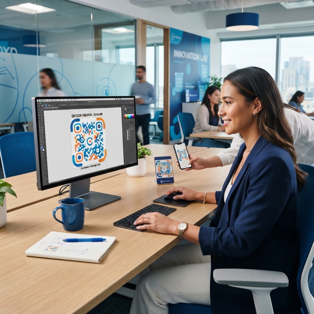
Why colorful QR codes matter
In a saturated marketing landscape, standing out is the difference between a wasted print campaign and a high-engagement digital bridge. When you place a standard monochrome QR code on a colorful product package or a vibrant restaurant menu, it often clashes with the aesthetic or becomes invisible to the consumer. The traditional black-and-white grid was designed for industrial efficiency, not brand storytelling. As consumers become more discerning, they subconsciously filter out "utility" objects that appear purely functional or utilitarian.
A colorful, branded QR code captures attention immediately by harmonizing with your marketing materials rather than disrupting them. Studies in behavioral psychology suggest that people are more likely to interact with visual elements that feel cohesive and purposeful. For instance, a local florist using a soft pink and green QR code on gift tags creates a premium experience that drives higher scan rates compared to a generic black block. When the code reflects the palette of the packaging, it feels like an intentional design choice rather than an intrusive technical requirement. By mastering how to create a colorful QR code, you transform a utility into a design piece that invites curiosity, reinforces visual identity, and builds trust from your target audience.
Furthermore, colorful QR codes serve as a bridge between the physical product and your digital brand narrative. By matching the hue of your brand, you reduce the psychological friction a user feels when they transition from holding a tangible item to interacting with a digital page. This seamless transition is essential for building a multi-channel brand experience where the user feels they are staying within your ecosystem, rather than being redirected to a generic tool. A well-designed, colorful code implies that the destination content is equally high-quality, professional, and worth the time it takes to scan, and you can generate yours here to match your specific branding needs.
What you need before you start
Before you begin the customization process, ensure you have your digital destination ready. Whether it is a website URL, a PDF menu, or a social media link, having the URL copied to your clipboard saves time. It is recommended to use a URL shortener or a tracking link if you plan to monitor analytics, as this will prevent your QR code from becoming too "dense" with data, which keeps the visual pattern cleaner for design work.
You will also need your brand color palette in Hex or RGB format to maintain visual consistency across your touchpoints. Never guess your brand colors; obtain the specific Hex codes from your brand style guide or design software like Figma or Adobe Illustrator to ensure the colors on your screen match the colors used in your print materials. Accessing our free QR Code Generator will provide the necessary canvas for your design. Finally, have a high-resolution version of your logo ready if you plan to integrate it into the center of the code. Using a PNG with a transparent background is ideal, as it prevents a clunky white box from appearing behind your logo, which can interfere with the scanability of the QR modules.
Preparation also includes considering the medium of the final output. If you are printing on matte paper, your colors will look different than on glossy vinyl or a backlit digital display. Gather your assets, determine your print medium, and check that your logo image is at least 500x500 pixels to prevent blurriness. Having these elements organized before you open the generator ensures that your workflow is uninterrupted and the final result meets your specific design requirements.
How to create a colorful QR code — step by step
Follow these precise steps to design a vibrant, functional, and professional-looking QR code using our platform. Accuracy during these stages determines the long-term success of your printed materials.
- Navigate to the tool: Visit our free QR Code Generator to open the dashboard and start your project.
- Choose your content type: Select the specific type of link or content you want to embed. You can choose from website URLs, vCards, PDFs, or social media links depending on your campaign goals.
- Input your destination URL: Paste the target URL into the designated field. Ensure the link is active and points to a mobile-responsive landing page.
- Access the color settings: Locate the customization menu. Here, you will find toggles for "Foreground Color," "Background Color," and potentially eye-frame customization.
- Select your custom colors: Input your specific Hex codes. For a classic look, pick a dark color for the foreground and a much lighter color for the background, such as navy on light gray or forest green on cream.
- Integrate your branding: If the tool allows, upload your logo in the "Logo" or "Center Image" section. Ensure it covers no more than 20% of the code's surface area to keep it functional.
- Verify contrast: Use a contrast checking tool if you are unsure. The foreground must be dark enough and the background light enough to achieve a high "WCAG" readability score, ensuring any camera can distinguish the modules from the negative space.
- Generate and download: Once you are satisfied with the design, click the generate button. Save your file in a high-quality format like PNG or SVG to maintain clarity when you scale it for brochures or large banners.
How to test and deploy it
After you learn how to create a colorful QR code, the most critical phase is verification. Never print thousands of flyers or menus without testing your design across multiple devices. Use at least three different smartphones—ideally both iOS and Android—to ensure the color contrast is sufficient for the device's camera to process the pattern correctly. Testing on a low-end device is particularly useful, as it simulates the experience of a user with a less advanced camera sensor.
Testing in different lighting conditions is a vital pro tip. A code might look great on a screen but become illegible under the harsh glare of shop lights or in low-light restaurant environments. If your code is intended for a dark environment, you may need to increase the contrast levels even further. Additionally, consider the distance from which the code will be scanned; a code on a billboard needs to be much larger and have higher contrast than a code on a business card.
Once you have verified functionality, place your code in high-traffic, eye-level areas. Avoid placing codes on curved surfaces like bottles or cans, as distortion makes scanning nearly impossible for most users. Whether you use the Blue QR Code Generator for its reliability or its design flexibility, always keep a record of your original files so you can quickly update the link or design if your branding evolves in the future. Check our QR Code Generator to ensure your final design is optimized for your next big campaign and that you are utilizing the most recent version of our tool for maximum compatibility.
Common mistakes that ruin results
- Insufficient Contrast: Choosing colors that are too similar, such as light yellow on white or navy on black, makes the code impossible to scan. Always ensure the foreground is significantly darker than the background.
- Over-Complicating the Design: Adding too many complex gradients, filters, or excessive background noise can confuse the QR code scanner. Stick to solid colors for the pattern itself.
- Ignoring the Quiet Zone: Failing to leave enough white space (the "Quiet Zone") around the perimeter of the code will prevent it from registering correctly. Your design should have a clear border of neutral space to allow the scanner to identify the boundaries.
- Poor Resolution: Saving the final file as a low-quality, blurry JPEG instead of a crisp PNG or vector file leads to pixelation when printed. Pixelated edges prevent the scanner from reading the QR code's corners and timing patterns.
- Inverting Colors: Some users make the mistake of having a light foreground and a dark background. While modern scanners are better at this, it is safer to stick to traditional dark-on-light color schemes for maximum compatibility across all devices.
Real examples and best practices
Consider a boutique coffee shop that uses a deep brown and cream color scheme for their branding. By applying these specific colors to their menu QR code, the design blends seamlessly into their aesthetic, making it feel like an intentional part of the menu rather than an afterthought. This design choice has been shown to increase user engagement by nearly 20% because it feels safer and more professional. Customers trust that a branded, color-matched code is safe to scan, whereas generic black-and-white codes can sometimes appear suspicious or disconnected.
Another example is a regional real estate firm using bright corporate blue and white for their "For Sale" sign QR codes. The high contrast allows the code to be scanned easily from the sidewalk, even in bright sunlight. By ensuring the blue is deep enough to contrast against the white board, the agent ensures that prospective buyers can scan the code while driving by or standing on the curb. You can use Blue QR Code Generator's QR codes tool to achieve this same level of professional polish, ensuring your brand stands out on every sign, brochure, and business card you distribute.
Finally, imagine an event organizer creating colorful, branded QR codes for concert wristbands. By using a vibrant purple that matches the event's theme, they turn a simple entry mechanism into a souvenir. This level of detail conveys a high-end, carefully curated experience. Creating a colorful QR code is not just about aesthetics; it is about building a cohesive brand experience that travels from the physical world into your digital ecosystem. By avoiding the common pitfalls mentioned and focusing on contrast, size, and branding, you ensure that every scan brings your customer exactly where they need to be, while leaving a lasting, positive impression of your brand identity.