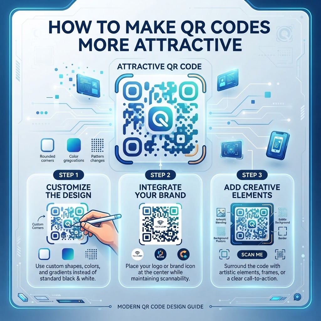
Why Making QR Codes More Attractive Matters in 2026
By 2026, the ubiquity of QR codes has led to a phenomenon known as 'QR fatigue.' When consumers see the same standard, uninspired, high-contrast monochrome boxes on every flyer, label, and screen, they begin to subconsciously ignore them. Attractive QR codes serve as a pattern interrupt. When a code is visually integrated into a brand’s color palette or features a custom frame, it signals to the user that the destination link is curated, safe, and professional. This psychological impact is profound; a well-designed code suggests a high-quality user experience on the other side of the scan, whether it leads to a restaurant survey or a landing page.
Beyond aesthetics, visual customization enhances brand consistency. Most smartphones today are equipped with powerful cameras that can handle slightly stylized codes, provided the error correction levels remain robust. When a business ignores the visual aspect, they miss a prime branding opportunity. An attractive code acts as a visual hook. Imagine a boutique store that uses a custom-branded code in their window display versus one using a default pixelated square. The former becomes an asset that fits the interior design, while the latter feels like a utilitarian afterthought. Furthermore, custom designs can be used to direct attention to specific calls to action. By using subtle brand colors, logos in the center, and rounded modules, you transform a technical necessity into an elegant piece of visual marketing that encourages engagement through professional appeal and aesthetic trust.
How It Works Technically: Balancing Aesthetics and Scannability
The technical foundation of any QR code relies on the Reed-Solomon error correction algorithm. This algorithm allows a certain percentage of the code to be obscured or altered without breaking the ability of a smartphone camera to decode the information. When we talk about making a code 'attractive,' we are essentially navigating the delicate balance between the data density and the visual freedom allowed by this error correction. Each QR code is essentially a grid of modules. The 'quiet zone'—the empty border surrounding the code—is the most critical technical component. No matter how beautiful you make the inner design, if you infringe upon this quiet zone, the code will fail to scan. This is where users often make mistakes, crowding the code with heavy design elements.
To keep a code scannable while customizing it, you must prioritize high contrast. Most smartphones require a significant luminance difference between the dark modules and the light background. Even if you use brand colors, the dark elements must remain dark enough to be distinct from the background. Furthermore, the 'finder patterns'—the three large squares in the corners—are the most important parts of the code. Many modern generators allow for soft corners or slight color shifts, but altering these too much can confuse the decoder software on older devices. Understanding these technical constraints allows you to push the boundaries of design. For instance, using a WiFi QR code with a softened, rounded module design retains its utility while looking modern and approachable compared to the harsh, rigid edges of traditional codes.
Step-by-Step Guide Using BlueQRCode.com
Creating a beautiful code at blueqrcode.com is a streamlined process designed for professional results. First, navigate to the generator portal. Select the type of content you wish to share, such as a URL, vCard, or document. Once your content is inputted, you are presented with the customization dashboard. Start with the 'Design' or 'Style' tab. Here, you can adjust the module shapes—moving away from traditional squares toward circles or diamond-shaped dots can significantly improve the 'premium' feel of your asset. Next, implement your brand's color palette. We recommend using a dark, saturated color for the foreground modules and a clean, light color for the background, ensuring you maintain a strong contrast ratio.
The third step is adding your logo. Uploading a brand logo to the center of the QR code is perhaps the most effective way to improve brand recall. When uploading a logo, ensure it has a transparent background to avoid obscuring the surrounding data modules. The generator will automatically adjust the error correction level, usually bumping it to 'High' to ensure that the covered portion doesn't prevent a successful scan. After this, customize the frame. Frames provide context to the user, telling them exactly what to expect. Using a frame with a clear call to action, such as 'Scan for Details' or 'Download our App', turns the visual design into a communicative tool. Once satisfied, test the code with multiple devices to confirm that your specific aesthetic choices haven't impacted functionality. If you are creating a vCard QR code for your professional business card, a clean, minimal design with a logo in the center is the gold standard for networking success.
Best Practices for Deployment: Size, Placement, and Format
Even the most beautiful design will fail if the deployment strategy is flawed. The first rule of deployment is scale. A QR code must be large enough to be captured by a smartphone camera from a reasonable distance. For printed materials like flyers or business cards, the code should be at least 2cm by 2cm. For signage or outdoor posters, you must scale the code up proportionally. If the code is placed too high or too low, users will struggle to reach it, leading to a drop in engagement. Always position your code at eye level where possible. Lighting is also a critical factor; avoid placing glossy, reflective QR codes under direct spotlights or in areas with high glare, as the camera will not be able to resolve the contrast needed for scanning.
Regarding format, vector files are essential for professional printing. While PNGs are fine for digital screens, using SVG or EPS formats ensures that your custom-designed QR code never looks pixelated or blurry, regardless of the print size. This is particularly important if you are using specific, intricate module shapes that lose their definition when rasterized. When you are printing on different surfaces, such as fabric, plastic, or metal, consider the texture. A rough or uneven surface can distort the QR code pattern, rendering it unreadable. Always perform a test print on the exact material you intend to use before committing to a large run. By following these placement and sizing guidelines, you ensure that your investment in design actually yields the intended results for your marketing campaign.
100% Free — No signup required
Create your How to Make QR Code More Attractive in seconds
Create Free QR Code →Common Mistakes to Avoid
The most frequent error in QR code design is over-customization. There is a fine line between a stylized, attractive code and a chaotic, unreadable one. Avoid using overly complex images or gradient-heavy logos as the centerpiece, as these can conflict with the digital modules. Another major mistake is reducing the contrast too much. While pastel colors might fit a specific brand aesthetic, they often fail the 'scannability test' under real-world lighting conditions. If a user cannot scan your code in three seconds, they will walk away, regardless of how 'pretty' it is. Always maintain a stark, high-contrast difference between the dark foreground and the light background.
Another common pitfall is ignoring the 'quiet zone.' Even if your code is visually stunning, if you place it too close to other graphic elements, text, or the edge of a page, the smartphone camera will fail to identify the boundaries of the code. Furthermore, many businesses forget to include a clear call to action. A beautiful code sitting on a page without context is confusing. Does it lead to a website? A contact form? A menu? Always include a simple instruction next to the code. Finally, never test your code only on your own device. Use a variety of phones—both iOS and Android, new and older models—to ensure that your design choice remains universally accessible. Avoiding these common errors ensures that your code is not just a piece of art, but a functional gateway that bridges the gap between physical and digital spaces effectively.
Concrete Use Cases by Industry
In the hospitality industry, QR codes are essential for modern guest experiences. A restaurant can utilize an elegant, color-matched QR code on their menus to lead guests directly to an online ordering portal or a high-quality photo gallery of their dishes. By branding the code with the restaurant's logo and using the brand’s signature color, it becomes part of the dining decor rather than a functional afterthought. In the corporate sector, human resources departments are using stylized QR codes on employee ID badges or recruitment booths to allow instant access to digital brochures, company values, or application portals, making the process look polished and tech-forward.
The retail industry benefits immensely from custom-designed codes on product packaging. For a luxury brand, a QR code that looks like a high-end graphic element can lead to an 'authenticity certificate' or an exclusive 'behind-the-scenes' video of the craftsmanship process. This creates a value-add experience that justifies the premium price point. Similarly, event management teams use custom codes for event check-ins and registration. A code that matches the event's theme—perhaps using a specific color scheme or event logo—builds anticipation and creates a seamless 'digital concierge' experience for attendees. Whether it is for a retail display, a corporate event, or a professional office setting, the key is consistency. When the code reflects the identity of the brand, it stops being a utility and starts being an experience, inviting users to interact with confidence and curiosity.
Summary and Next Steps
Creating an attractive QR code is a blend of science and art. We have explored the technical importance of maintaining high contrast and respecting the quiet zone, the design steps available at blueqrcode.com, and the strategic importance of placement and testing. By moving away from default designs and embracing customization, businesses can significantly improve their engagement metrics. A well-designed code is an asset that communicates quality and professional attention to detail, making it a critical component of any modern marketing strategy. The era of the boring, utility-only QR code has passed; the era of branded, aesthetic engagement is here to stay.
Your next step is to log into your blueqrcode.com account and begin experimenting. Start by identifying one of your current touchpoints—perhaps a business card, a lobby sign, or a product label—and create a new, branded version of your QR code. Use the custom color palette tools to align with your brand, add your logo to build trust, and select a modern, rounded module style. Once created, print it out on your final material and perform a real-world test. Observe the feedback from your audience; you will likely find that a more attractive, deliberate design leads to a higher scan volume. Continue to refine your design choices based on the specific context of your deployment, and remember that our support team and resource library are always available to help you optimize your digital connections for the best possible results.
No watermark · No expiry · Works on all phones
Your QR code is ready in under 30 seconds.
Generate Free QR Code →