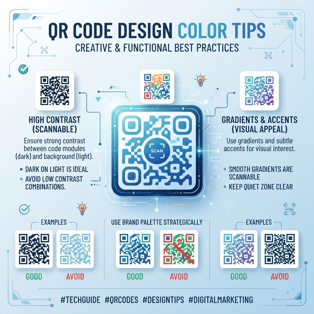
1. Why QR Code Color Design Matters in 2026
As we move deeper into 2026, the visual saturation of our environment has reached a point where generic, stark black-and-white QR codes are increasingly ignored by consumers. Modern branding demands that every touchpoint—including the humble Quick Response code—reflects the identity, personality, and aesthetic values of the organization. Many businesses are discovering that a well-designed, on-brand QR code can significantly increase engagement rates, turning a mundane utility into an extension of the brand narrative. When a QR code matches the color palette of a high-end invitation or a sleek retail display, it fosters a sense of trust and professionalism that plain codes often lack.
Beyond aesthetics, the integration of color in design is a powerful tool for visual hierarchy. By strategically using color, marketers can lead a user’s eye toward the call-to-action, ensuring that the QR code acts as a beacon rather than a cluttered element on the page. However, this shift toward visual appeal brings technical risks. The primary reason a QR code fails is a lack of contrast, which renders the data undecipherable to standard mobile scanners. In 2026, most smartphones are equipped with high-resolution cameras, but they still rely on the fundamental physics of light and dark contrast to map the modules of the QR code. If the foreground and background colors are too similar, or if the lighting conditions are suboptimal, the software may struggle to isolate the pattern. Mastering these color dynamics is now an essential skill for digital marketers, graphic designers, and business owners who want to maintain high scan conversion rates while achieving a distinctive visual presence. Balancing these competing needs—beauty and function—is the cornerstone of successful modern marketing.
2. How QR Code Color Dynamics Work Technically
Technically, a QR code functions by organizing black and white modules into a grid. Scanners operate by detecting the contrast between the dark foreground modules and the light background. This process, known as thresholding, identifies the modules regardless of the specific hue of the colors, provided that the level of contrast between the two is sufficiently high. The software does not actually look for black or white; it looks for two distinctly different levels of intensity. Therefore, it is entirely possible to create a functional QR code using deep blue and soft yellow, or dark green and white, provided the dark color is significantly darker than the light color. This scientific reality allows for massive creative freedom within a rigid mathematical framework.
However, the technical limitations are strict. If you use a dark foreground color, you must use a light background color, and vice-versa. Many businesses often make the mistake of using low-contrast color combinations, such as light grey on white or deep red on brown, which causes the scanner to struggle to differentiate the individual squares. Furthermore, the positioning of the timing patterns—the large squares in the three corners—requires high visibility to orient the scanner. If you apply a color filter or a gradient that obscures these patterns, the camera will fail to identify the orientation of the code. For those interested in deeper technical implementation, you can learn more about code stability by reading our guide on qr-code-placement-best-practices. By understanding these fundamentals, you can manipulate the visual appearance of your QR code without sacrificing the underlying data integrity that allows for instantaneous, seamless scanning in the field.
Try it now: Generate a free QR Code Design Color Tips →
3. Step-by-Step Guide Using BlueQRCode.com
Creating a professionally designed, high-contrast QR code is an intuitive process when utilizing the right tools. At blueqrcode.com, we have built our interface to simplify these complex technical requirements, allowing you to focus on the creative aspect while we handle the data encoding. Start by navigating to our home page and selecting the type of data you wish to embed, such as a website link, a qr-code-vcard-business-card-digital, or a dynamic PDF. Once your data is entered, you will reach the customization panel, which acts as your design laboratory.
Inside the customization suite, focus on the 'Color' and 'Design' tabs. Begin by selecting your foreground color using our color picker; we recommend choosing a color from your brand guidelines that is saturated and dark. Next, select your background color. Always ensure the background remains lighter than your foreground color to maintain the required contrast ratio. Avoid using gradients that traverse the entire code, as these can confuse some older scanner software; if you must use a gradient, ensure it is subtle and does not interfere with the contrast of the orientation squares. After choosing your colors, you can further refine your code by modifying the pixel shapes, such as rounded corners, which adds a modern, soft touch compared to standard square blocks. Once satisfied, perform a quick test by scanning the code with multiple devices to ensure reliability under different lighting conditions. For those who need to manage multiple codes for various campaigns, checking out our free-qr-code-generator-no-sign-up-no-watermark will help you maintain consistency across your entire portfolio, ensuring that all your QR assets remain on-brand and perfectly scannable for your diverse customer base.
4. Best Practices for Deployment: Size, Placement, and Format
Once you have finalized the design of your QR code, the way you deploy it becomes the next critical phase. A beautiful, high-contrast code will fail if it is too small to be captured by a smartphone camera from the expected distance. For print media, the general rule of thumb is that the size of the QR code should be at least one-tenth of the viewing distance. For example, if a poster is intended to be viewed from 10 feet away, your QR code should be at least one foot in size. This ensures the optics of the smartphone can accurately resolve the individual modules from a distance, avoiding the blurred edges that often lead to scanning errors.
Placement is equally important. Avoid placing your QR codes in areas with high levels of glare, such as on glossy surfaces exposed to direct sunlight or near bright, reflective signage. If you are placing a code on a curved surface, like a bottle or a cylinder, ensure the code is flat enough that the scanner can read the entire geometry without distortion. If the code wraps around a corner, the scanner might only capture a portion of the data, which will lead to a failed attempt. Additionally, maintain a 'quiet zone'—a buffer of white space around the perimeter of the QR code—which helps the scanner isolate the code from the background clutter of your design. Always test your code in the exact environment where it will be displayed; a code that scans perfectly on your desktop screen may behave differently when printed on a matte banner or a textured storefront window. These physical considerations are just as important as the color palette you have chosen for your design.
5. Common Mistakes to Avoid in Design
The most common error many businesses make when personalizing their QR codes is prioritizing artistic flair over functional visibility. A frequently encountered mistake is the use of 'inverted' contrast—placing a light-colored foreground on a dark background. While some modern scanners can interpret this, it is not universally supported and will lead to a significant drop in conversion rates. Another common error is adding too much complexity to the design, such as integrating logos that are too large. When you overlay a logo in the center of the QR code, it covers up data modules. While error correction algorithms can often compensate for this, exceeding the capacity of these algorithms by placing a massive or opaque logo will result in a non-functional, broken code.
Furthermore, avoid using colors that are too close in value, such as a dark green background with a dark blue foreground. Even if they appear distinct to the human eye, the lack of luminance difference will cause the scanner to treat the entire area as a single, unreadable block of color. It is also a mistake to 'dither' or use complex patterns within the modules. Keep the shapes solid and clean to ensure that the edges remain sharp. Finally, never ignore the importance of testing on multiple devices. Many users make the mistake of testing with a single, high-end flagship phone, which often has a superior camera sensor that can handle poor contrast better than a mid-range or budget device. By assuming that a scan on a top-tier phone is universal, you may inadvertently alienate a large segment of your audience who are using older, less capable hardware. Aim for the lowest common denominator to ensure universal access for all potential customers.
6. Concrete Use Cases by Industry
In the hospitality industry, QR codes are ubiquitous, but they are often neglected in terms of design. Restaurants can elevate the guest experience by tailoring the color of their digital menu codes to match their interior design theme—such as using deep forest greens for a rustic bistro or metallic gold on matte black for a fine dining establishment. This makes the code feel like an intentional part of the table setting. When customers scan a code that matches their surroundings, they are more likely to engage with the digital content provided, whether it is a menu or a qr-code-restaurant-menu for ordering items directly.
The retail sector also sees great success when codes are treated as design elements. Clothing stores can use branded QR codes on clothing tags or signage to lead users to size guides or lookbooks. By using colors that reflect the current season's collection, these codes become part of the visual marketing strategy rather than a purely functional necessity. In the field of professional services, accountants or consultants can use branded vCards on business cards, ensuring the color scheme of the code aligns perfectly with their corporate identity. This creates a cohesive, professional package that leaves a lasting impression on potential clients. Finally, event organizers and conference managers often use colored codes for badge entry and session registration. By color-coding these QR codes based on ticket tiers or access levels, organizers can improve workflow efficiency while maintaining a premium look that enhances the overall professional atmosphere of the event space.
7. Summary and Next Steps
Creating effective QR code designs is a journey of balancing creativity with the cold, hard requirements of optical scanning technology. By focusing on high contrast, maintaining adequate sizing, and respecting the quiet zone, you can transform a standard utility into a powerful branding asset. Throughout this guide, we have explored how specific color choices impact the usability of your codes, how to leverage tools like blueqrcode.com to streamline the generation process, and how to avoid the common pitfalls that render codes unusable. The technology in 2026 is robust, but it still requires a thoughtful approach to ensure it meets the needs of every user.
As you move forward with your campaigns, remember that the most successful QR code designs are those that feel effortless and natural within their environment. Start by analyzing your brand guidelines and choosing a primary color that ensures excellent contrast against your intended background. Implement these designs in small batches, conduct rigorous testing across multiple devices in various lighting conditions, and track your scan rates to refine your approach. For those ready to begin, our platform offers all the tools you need to create custom, high-quality codes. Whether you are launching a new marketing campaign or simply upgrading your existing digital touchpoints, our generators provide the reliability and design flexibility required for modern businesses. Visit blueqrcode.com today to start experimenting with your own brand-aligned QR code designs, and take the first step toward a more integrated, professional, and visually compelling customer interaction strategy.
No watermark · No expiry · Works on all phones
Your QR code is ready in under 30 seconds.
Generate Free QR Code →