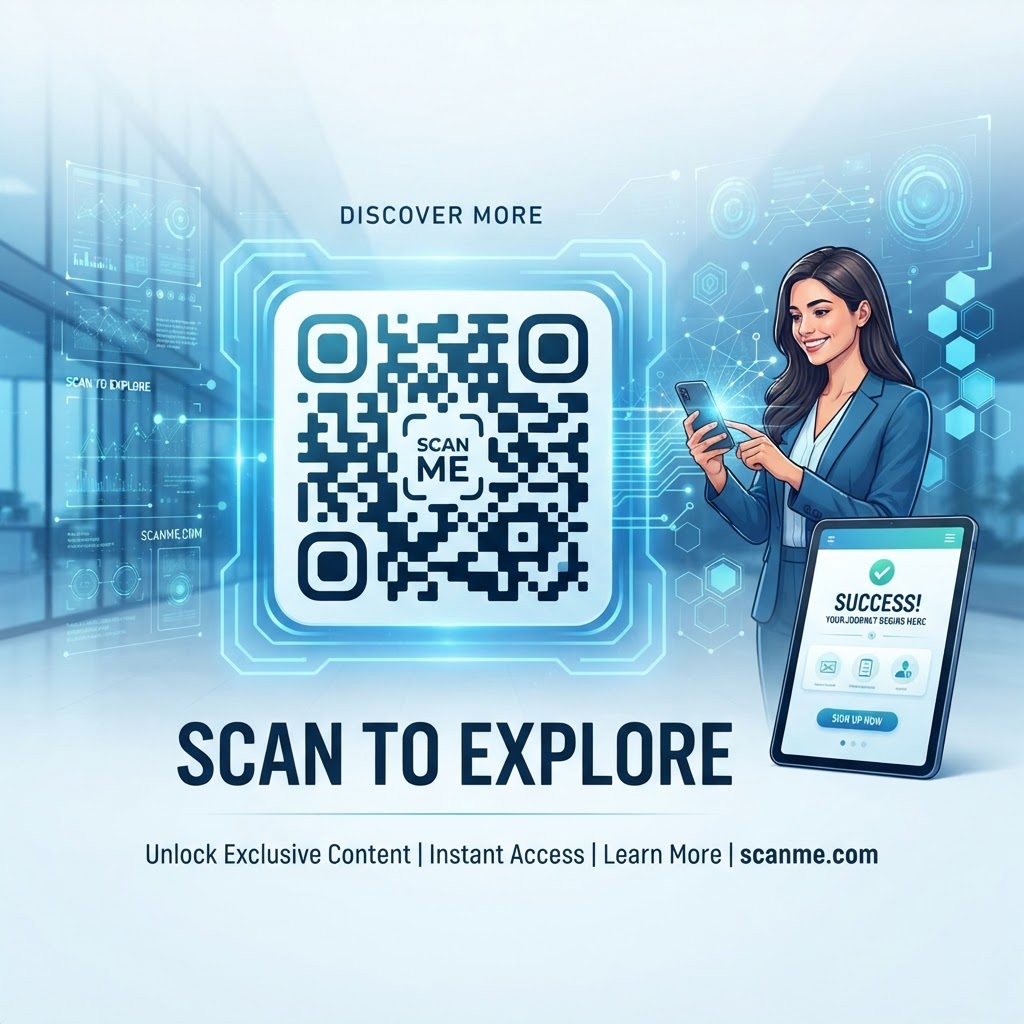
Why QR Code Call to Action Wording Matters in 2026
As we navigate through 2026, consumer attention spans have reached an all-time low. When an individual encounters a QR code in a retail space, on a product label, or in a brochure, they are subconsciously evaluating whether the time required to scan is worth the benefit they will receive. If the code is presented in isolation, the user faces a 'knowledge gap'—they do not know if the code leads to a website, a dangerous phishing link, a simple menu, or a tedious sign-up form. A well-crafted call to action eliminates this ambiguity, providing the necessary motivation for the user to pull out their phone and perform the scan.
Furthermore, the competitive nature of modern marketing means that you have only a fraction of a second to make an impression. Clear, actionable, and benefit-driven language serves as a bridge, transforming a passive passerby into an active participant in your digital ecosystem. When you use tools like our free-qr-code-generator-no-sign-up-no-watermark, the final output is only as effective as the context you provide around it. By explicitly stating what happens after the scan—such as 'Scan to save 20%' or 'Scan for instant WiFi access'—you reduce the mental friction that often prevents a user from engaging. In a year where digital clutter is rampant, clarity is a competitive advantage. Businesses that prioritize descriptive and compelling CTAs see significantly higher scan-through rates compared to those that leave their codes naked and unexplained. This is particularly crucial for complex integrations, such as a qr-code-for-table-reservation, where the user needs to understand that a booking process will immediately follow the interaction.
How It Works Technically
Technically speaking, a QR code is simply a data container—a two-dimensional barcode that stores a string of information, usually a URL, which tells the operating system on a smartphone which web address to open in the browser. When the camera app detects the patterns in the QR code, it processes the image data and prompts the user to visit that destination. However, the technical ease of scanning does not equate to the willingness to do so. The psychology behind the scan is entirely independent of the underlying technology. From the perspective of the smartphone's software, the CTA is just text printed on paper or rendered on a screen, but to the human brain, it is the primary motivator for the scan action.
The technical implementation of the CTA involves balancing the size of the QR code with the legibility of the surrounding text. The physical placement of the text is critical; it should always be positioned in close proximity to the code, preferably directly below or to the side, to establish a visual hierarchy that guides the eye. Most smartphones are designed to focus on the code quickly, but the eyes will inevitably drift to the accompanying text to confirm the purpose of the scan. You must ensure that your CTA text uses high-contrast colors and a legible font size that matches the scale of the QR code itself. If the code is large but the text is tiny, the user might perceive the code as 'important' but still feel unsure about its purpose, leading to hesitation. By integrating these technical design principles with our platform, you ensure that the seamless functionality of the code is matched by a transparent, inviting, and highly professional user experience that rewards the user for their curiosity.
Try it now: Generate a free QR Code Call to Action Wording →
Step-by-Step Guide Using BlueQRCode.com
Starting with our platform is a streamlined process designed for efficiency. First, visit blueqrcode.com to select your desired format. Whether you need a URL redirect, a text snippet, or a vCard, the platform handles the encoding automatically. The initial step is to select the type of content you wish to distribute. For example, if you are setting up a professional contact system, you might choose the qr-code-vcard-business-card-digital option to ensure your details are perfectly formatted for your clients. Once you have generated the code, download the high-resolution image file. Do not stop at just the image; the true value comes from the presentation layer.
After you have your code, prepare your design layout. Whether you are using a digital layout tool or print-ready software, place the QR code in a central position. Below the code, add your CTA text using clear, command-based verbs. Instead of 'Link', use specific language like 'Scan to download the menu' or 'Scan to view our location'. Test your code at various distances to ensure the scan is instantaneous. If you encounter any issues during the initial testing phase, refer to our guide on how to test-qr-code configurations. Once confirmed, you can print your material or deploy it digitally. Always remember to maintain a buffer space—what designers call 'quiet zone'—around the code to ensure the camera can isolate the modules easily. The combination of our robust generator and your intentional, benefit-driven CTA creates a powerful marketing asset that stands out to customers in any environment, from busy retail stores to quiet professional offices.
Best Practices for Deployment (Size, Placement, Format)
Effective deployment relies on the physical and visual context of the QR code. First, consider the size relative to the distance from which a user will scan. A small QR code on a business card can be quite small (minimum 2x2 cm), but a QR code on a wall or a billboard must be significantly larger to maintain the required resolution for the camera sensor. As a rule of thumb, the distance-to-size ratio should be approximately 10:1. If you place a code on a restaurant table, the size must be optimized so that customers don't have to awkwardly reach or hover to trigger the scan. Furthermore, placement is crucial for safety and usability; avoid surfaces that are highly reflective, as the glare can make the QR code unreadable by smartphone sensors.
In terms of formatting, ensure the contrast is high. Black code on a white background remains the gold standard for scanability, but you can use other colors as long as the background is significantly lighter than the foreground code. Avoid over-complicating the center of the code with branding if it threatens the structural integrity of the 'finder patterns'—the three large squares in the corners. Regarding the CTA text, keep it concise. Five to seven words is the ideal length; anything more starts to clutter the design. Phrases like 'Scan for exclusive rewards' or 'Scan to connect' perform consistently well across different demographics. Always consider the environmental noise: if your QR code is located in a loud, busy environment, your CTA text needs to be even larger and more direct to cut through the surrounding visual distractions. Proper placement transforms a utilitarian tool into a seamless, high-engagement marketing channel that feels intuitive to the user.
100% Free — No signup required
Create your QR Code Call to Action Wording in seconds
Create Free QR Code →Common Mistakes to Avoid
The most common mistake businesses make is assuming that a QR code is self-explanatory. Never simply print a code without an accompanying CTA. Users are conditioned to avoid scanning 'mystery' codes due to security concerns; if they do not know the intent of the scan, they will ignore it. Another major error is the failure to include a mobile-optimized destination. If you generate a beautiful code that leads to a desktop-only website that is difficult to navigate on a phone, the user will drop off immediately, resulting in a wasted scan. Always verify that your landing page provides an excellent mobile experience. Additionally, many people forget to check the 'scanability' of their print quality. Using cheap, low-resolution inkjets to print complex codes can lead to blurred lines, which prevents the camera from identifying the data modules correctly.
Another frequent oversight is ignoring the importance of branding consistency. While you want your CTA to be bold, it should not clash with the overall aesthetic of your campaign. Use fonts and colors that reflect your brand identity while keeping the text legible. Avoid placing codes in areas where the user has no network connection, such as deep inside a building or in a subway tunnel, unless you have specifically addressed offline accessibility. Finally, resist the urge to provide a link that requires an immediate, lengthy registration form. If the goal is engagement, make the entry point as low-friction as possible. Every extra field in a form is a barrier that discourages the user. Focus on providing value first—whether it's an informational PDF, a discount, or a contact card—and save the heavy data collection for later stages in the customer relationship.
Concrete Use Cases by Industry
In the restaurant industry, the QR code has become the gold standard for contactless interactions. Using a qr-code-restaurant-menu allows staff to focus on service while providing customers with a dynamic, easy-to-update view of offerings. Here, the CTA is simple: 'Scan to View Our Menu'. The context is so strong that the scan is almost instinctive. In the retail sector, particularly for boutiques, you can use codes to provide information about the sustainable sourcing of products. A CTA like 'Scan to meet the maker' creates an emotional connection that justifies the time spent scanning, which is far more effective than a generic 'Scan for info'.
For the service industry, such as medical offices or salons, efficiency is the goal. Using a code for patient forms or booking saves the front desk significant time. A CTA such as 'Scan to check in' or 'Scan to view our safety policy' provides clear instructions that guide the user's workflow. Real estate agents also benefit from QR codes placed on property signs. Instead of forcing passersby to memorize a website, a code with the CTA 'Scan to view home photos' invites immediate engagement during the limited time a potential buyer is in front of the house. In each of these cases, the CTA serves as a 'micro-prompt' that lowers the barrier to action. By tailoring your wording to the specific intent of the user—whether it is browsing, booking, or learning—you significantly improve the likelihood that your QR code will deliver a tangible return on investment for your specific business goals.
Summary and Next Steps
Mastering the art of QR code call to action wording is a fundamental skill for any business operating in 2026. As we have explored, the code itself is merely the vehicle, while the CTA is the driver. By providing clear, benefit-oriented guidance, you effectively bridge the gap between physical curiosity and digital action. You now have the knowledge to select the right language, optimize your visual design, and avoid the common pitfalls that hinder engagement. Your strategy should always start with understanding the user's intent: why would they want to scan this code right now? Once you identify that motivation, use your CTA to promise the solution to that need.
The next step is to put these strategies into practice. Visit our platform to generate your next set of codes with a refreshed perspective on design and placement. Think about the physical environments where your customers interact with your brand and place your codes thoughtfully, ensuring they are accessible, clear, and accompanied by compelling instructions. Don't be afraid to experiment with different CTA variations to see which resonates best with your audience. Continuous testing and optimization are the hallmarks of a successful marketing strategy. By applying these professional standards to your QR codes, you ensure that every scan represents a meaningful connection, a potential lead, or a satisfied customer. Start your journey toward better QR code engagement today, and watch as your digital interaction metrics improve through the simple power of effective communication and well-placed, purposeful calls to action.
No watermark · No expiry · Works on all phones
Your QR code is ready in under 30 seconds.
Generate Free QR Code →